32. Chicago Bears (pictured: Kyle Fuller, CB)
/cdn.vox-cdn.com/uploads/chorus_image/image/58927353/830552590.jpg.0.jpg) The Bears uniforms aren't terrible. They're just a little bland. From time to time, they don an orange jersey or dark blue pants to go with the dark jersey and helmet, but even those could use a fresh update. One of the teams in the NFL to stick to their traditions, the Bears need something to boost its players, and to boost its overall look - two circumstances that are may be a direct effect of the other.
The Bears uniforms aren't terrible. They're just a little bland. From time to time, they don an orange jersey or dark blue pants to go with the dark jersey and helmet, but even those could use a fresh update. One of the teams in the NFL to stick to their traditions, the Bears need something to boost its players, and to boost its overall look - two circumstances that are may be a direct effect of the other.31. Las Vegas Raiders (pictured: Rico Gafford, WR)
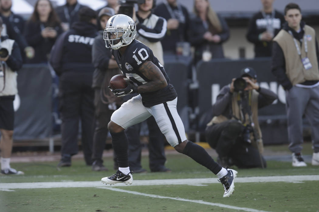 The Raiders are now hauling themselves into Sin City, so hopefully a new location will lift their spirits with having such a bland look. Black and silver look good together, but they really only use two variations, with only two primary colors. Pictured is Rico Gafford, a former Wyoming Cowboy, who is fighting for a regular roster spot. His 40+ yard touchdown reception from Derek Carr toward the end of last season may help his cause. Not bad for a former cornerback converted to wide receiver.
30. Arizona Cardinals (pictured: Kyler Murray, QB)
 I didn't know Cardinals were so prominent in Arizona. Judging from the weather, the team should be called the Suns, or the Horizons, or the Face Melters. I don't have as much of a problem with the team name as I do with the uniform, and the lazy design of the logo, slapped onto the side of an all-white helmet, sans any stripes or flare whatsoever. The Cards should implement a new uni, as well as introduce a new color to the red and white scheme.
29. New York Jets (pictured: LeVeon Bell, RB)
 While the Jets did make strides to update their outdated uniforms last season, they still boast only a two-color scheme. The helmets are much nicer, as are the jerseys, but 2019 would have been a great time to incorporate a black, or a grey, and an anything other than forest green and stark white. LeVeon Bell brought a little flavor back to the team, as did slot receiver Jamison Crowder.
28. Atlanta Falcons (pictured: Brian Hill, RB/KR)
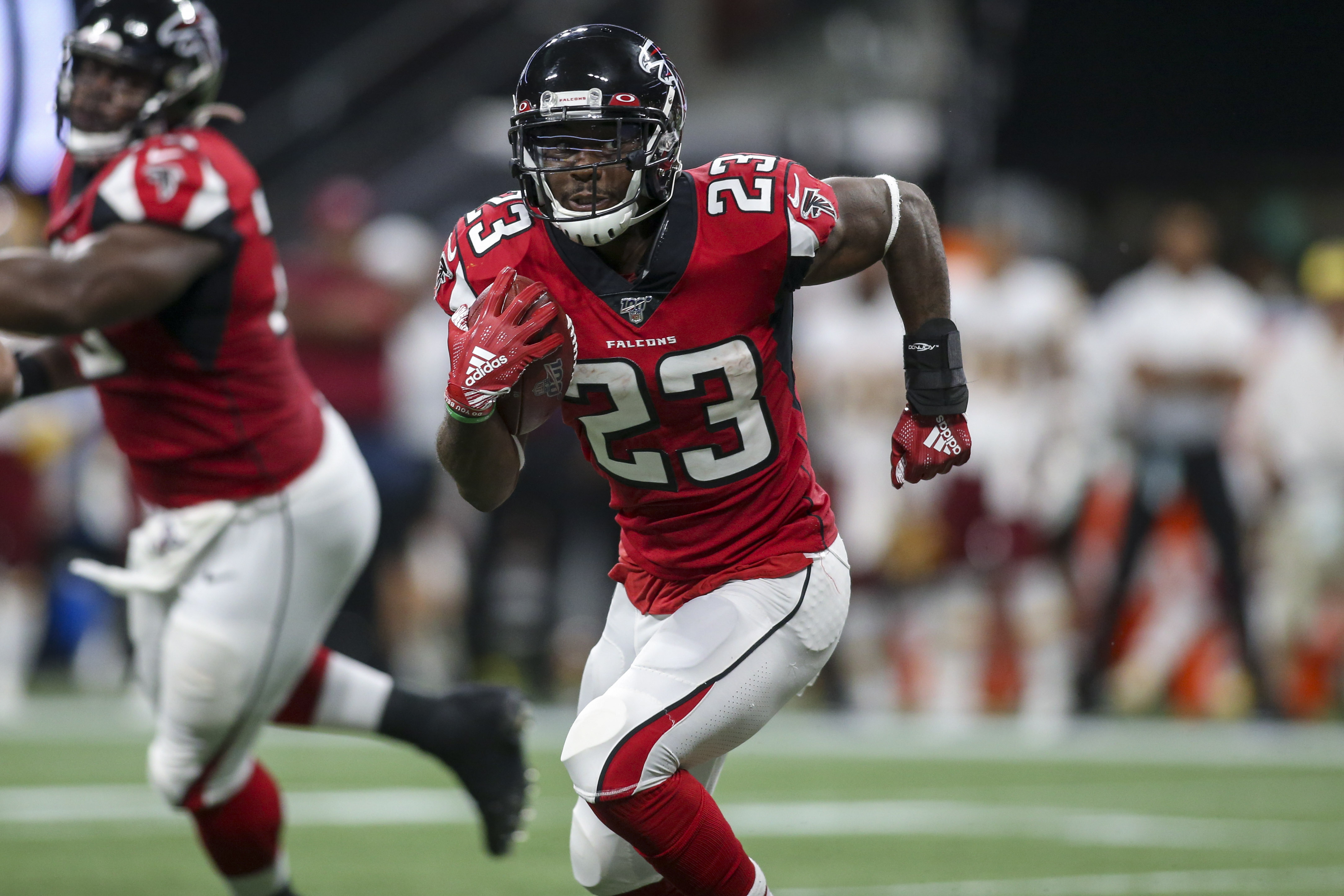 Black, red, and white are not bad. One of my high school teams, the Stratford Knights, wore these colors proudly. But the Falcons have donned these colors and these same uniforms for a long, long time. I'd like to see more use of the red helmet, maybe red pants, some black pants, and not just on Color Rush games. Pictured is former Wyoming Poke Brian Hill, who is currently number three on the Falcons running back depth chart, but is their number kicker returner for the coming season.
27. Kansas City Chiefs (picured: Tyreek Hill, WR)
 Tyreek Hill often looks like The Flash, dashing this way and that in his red and yellow getup. The Chiefs are at their best in their all red, but seemingly don't suit up this way often enough. Another team bent on tradition, I get it. I mean, the Chiefs won the last Super Bowl, so they must be doing something right. The white face mask is a nice accent against the red helmet, though the arrowhead emblem can probably go. The logo is not as bad as the Redskins, but it's close enough to fall under the scrutiny of Native-American preservation groups.
26. Carolina Panthers (pictured: Christian McCaffrey, RB)
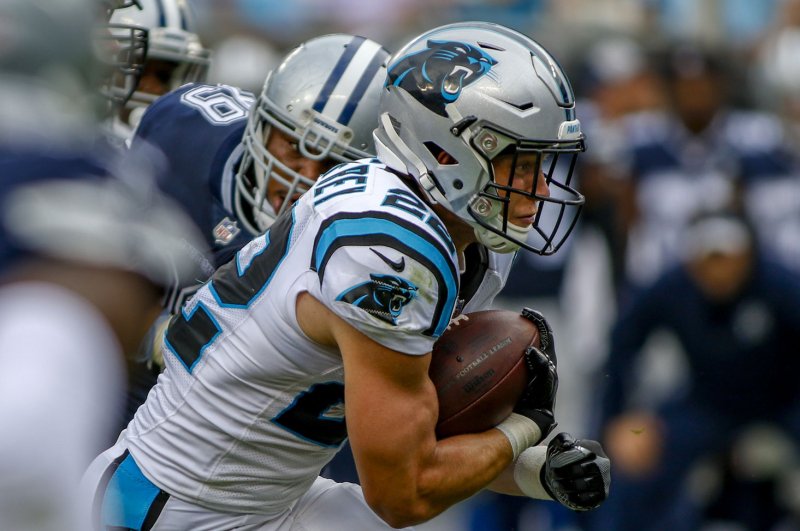 This is probably the Panthers' best look - white on white with a silver helmet and powder blue accents. When the organization was established, they stuck to their Tar Heel roots, keeping the blue, which I can appreciate. My biggest complaint with the look here is the lazy Panther sticker slapped onto the side of the helmet. I can probably deal a little better now that the Panthers are waxing on ousting Cam Newton, and that Christian McCaffrey will continue to be one of the best running backs in the game, no matter who is behind center.
25. Philadelphia Eagles (pictured: Miles Sanders, RB)
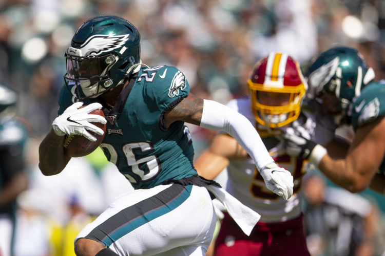 The Eagles have a pretty clean look, and the helmets are some of the best in the league. My only issue is the shade of green, which comes off a bit too heavy at times. I get this is why the Eagles usually don the white pants with the green jersey, and even usher in the black from time to time, but still. A lighter green might be a nice change to the traditional uniform. Pictured is Miles Sanders, a rookie running back who helped me win my Fantasy league.
24. Indianapolis Colts (pictured: Jack Doyle, TE)

23. Los Angeles Chargers (pictured: Austin Ekeler, RB)
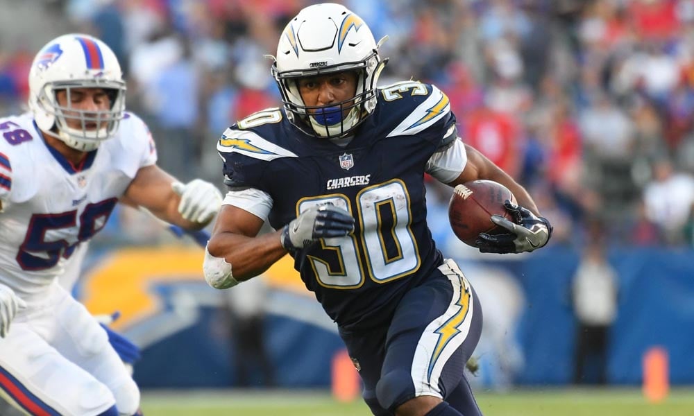 The Chargers have some pretty good uniforms in all their iterations and combinations. The white helmets are nice, the lightning bolt is cool, and the dark blue, as well as the powder blue, look good against the white. I've never really been a Chargers fan, likely because I've hardly ever seen any of their games. Austin Ekeler is one that I do like though, as his views on societal issues nearly match mine.
22. Jacksonville Jaguars (pictured: Leonard Fournette, RB)
/cdn.vox-cdn.com/uploads/chorus_image/image/56653705/usa_today_10271859.0.jpg) The uniform set pictured here are pretty nice. The teal and gold look great set against the black, and the two-tone helmet redesign was a nice change from the previous lazy old slap-on-a-sticker-and-call-it-a-day look. I'm just not a fan of when the Jags revert back to the uniforms of Maurice Jones-Drew yesteryear. Those were likely the worst the league had to offer, so the change they made a few years ago was definitely for the better.
The uniform set pictured here are pretty nice. The teal and gold look great set against the black, and the two-tone helmet redesign was a nice change from the previous lazy old slap-on-a-sticker-and-call-it-a-day look. I'm just not a fan of when the Jags revert back to the uniforms of Maurice Jones-Drew yesteryear. Those were likely the worst the league had to offer, so the change they made a few years ago was definitely for the better.21. Miami Dolphins (pictured: Preston Williams, WR)
 The old Dolphins uniforms of the Shula-Marino era were absolutely horrifying, as was the silly Flipper logo on the side of the helmet. In more recent years, the Fins lightened the aqua, and made the Dolphin on the helmet more slick and a little more fierce to match an overall slicker, cleaner look. Like the Jags, this was one of the better updates to float around the league. The aqua, orange, and white look great together. I had a pair of Nike Flights in middle school that was this exact color combination.
20. Tampa Bay Buccaneers (pictured: Chris Godwin, WR)
 Chris Godwin may not be catching passes from Jameis Winston anymore, but he still wears a pretty sweet uniform. Not as sweet as the older one, the one soaked in orange and white. This was not a bad change though, holding onto the orange, but making it more of an accent against red and pewter. The Bucs are supposed to be altering their look this coming season, and I have to say I would love to see a return to the old school creamsicle flavor.
19. Washington Redskins (pictured: Dwayne Haskins, QB)
 I love the Redskins uniform. I've been rooting for them since the days of Art Monk, John Riggins, and Joe Theisman, but I understand a lot more about the world now than I did back then. While the team still has the same look, boasting a great color scheme, their team name and logo really do them no favors. This seems to be one of the perks of American exceptionalism, but I know a lot of people would feel differently who don't have the same understanding I do. Great franchise with a lot of tradition, but change the name, please.
18. New England Patriots (pictured: Sony Michel, RB)
 This is the best look the Pats have to offer, and from what I understand, they are getting a few new alternations in a new Brady-less era. I like the team name and history behind it, but the Brady-Belichik combination has kept me from the rooting on the Pats. Hopefully, the team will stick to this particular look in the future.
17. Pittsburgh Steelers (pictured: John Connor, RB)
 I know this one is a favorite among commentators and analysts, and I have to admit, it is pretty nice. The black and yellow look good together, and the emblem on the side of the helmet is traditional and unique. Like the next team on the list, the team name honors the steel workers who basically created the city, which alludes to a blue-collar history for a blue-collar team. The emblem on only one side of the helmet is a nice touch that should never change.
16. Green Bay Packers (pictured: Aaron Jones, RB)
 This is the guy who won me my Fantasy league this past year. Doesn't he look great? I digress. I like the tradition of the Green Bay uni. The green and yellow look good together, the emblem on the helmet is simple but effective, and the team name alludes to a long culture of working-class heroes in the meat packing industry. The Packers should keep things just as they are in this case.
15. Denver Broncos (pictured: Courtland Sutton, WR)
 The best part about Denver's uniform is the Bronco on the side of the helmet. The design is a fantastic upgrade from the Elway-era capital D, and the dark blue works much better with the orange than the light blue ever did. The look pictured is the best one the Broncs have to offer.
14. San Francisco 49ers (pictured: Deebo Samuel, WR)
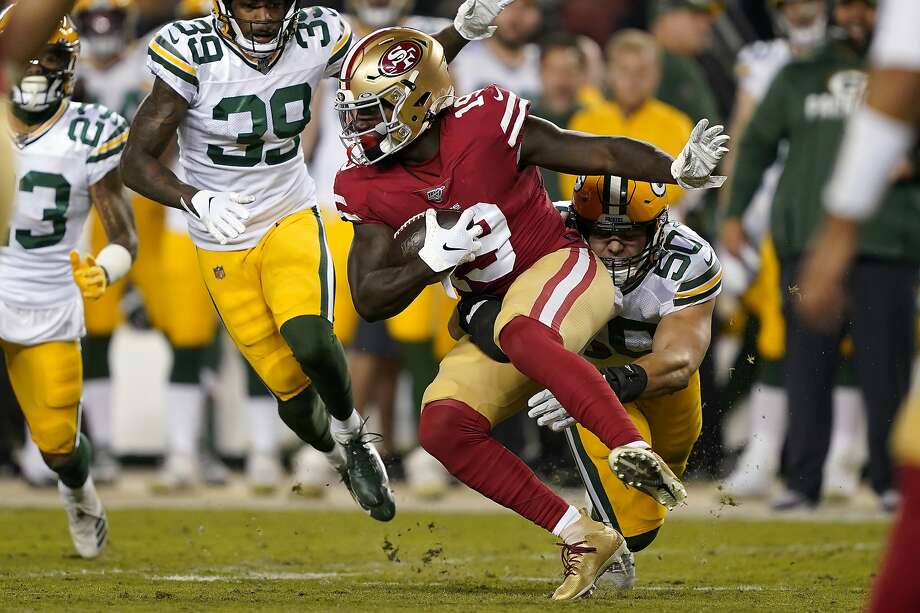 I used to not care for this uniform at all, but the majesty of the red and gold has grown on me in recent years. The 49er suit could use an update though, even if it's a simple tweak here or there. Gold helmet with a white jersey and red pants would be kind of sweet for away games, and a gold helmet with a red jersey and white pants would be a nice alternate at times.
13. Detroit Lions (pictured: Kenny Golladay, WR)
/cdn.vox-cdn.com/uploads/chorus_image/image/59643217/900102574.jpg.0.jpg) The Lions have a pretty sleek look here. They haven't done much upgrading from the Barry Sanders era, but they haven't really needed to. The few changes they have made have been subtle, just a little bit over time, making their uniform upgrades the standard for how the rest of the league should proceed as far that progression goes. Kenny Golladay was an integral part of my Fantasy team last season.
The Lions have a pretty sleek look here. They haven't done much upgrading from the Barry Sanders era, but they haven't really needed to. The few changes they have made have been subtle, just a little bit over time, making their uniform upgrades the standard for how the rest of the league should proceed as far that progression goes. Kenny Golladay was an integral part of my Fantasy team last season.12. New York Giants (pictured: Daniel Jones, QB)
 I used to love the Giants uniform when I loved Eli, Plaxico Burress, Jeremy Shockey, and Hakeem Nicks. That love has faded over time, but I still think this is a pretty good look for the G-Men, both home and away. They've made a change over the last few years with white pants, though I think the grey is better, and the lowercase NY on the side of the helmet is certainly better than the LT-Phil Sims era GIANTS script.
11. Baltimore Ravens (pictured: Lamar Jackson, QB)
 The Ravens have a pretty heavy look with the purple and black, but have enough variations to not make the uniform so ominous. Sports teams really love the state of Maryland, as the Terrapins plaster to state flag onto the helmet, and the Ravens wear it literally on their sleeves. This is a cool feature, and though the Ravens colors couldn't conflict any more with the Maryland flag colors, it still finds a way to work in subtle homage.
10. Seattle Seahawks (pictured: Jacob Hollister, TE)
 The Seahawks uni is a little heavy as well, but changes in the past decade have ushered in snippets of neon green to the jersey and pants, which gives the dark blue a clean, spry accompaniment. The Seahawk emblem on the helmet is legendary, and the newer checker design on it where most teams boast a stripe is a nice stroke of creativity. Jacob Hollister is former Wyoming Cowboy I'm always keeping an eye on.
9. Cleveland Browns (pictured: Odell Beckham Jr., WR)
8. Los Angeles Rams (pictured: Tyler Higbee, TE)
 Occasionally, the Rams don the old duds they wore back in the Dickerson days, which are nice, but their newest iteration is even nicer. The horns on the helmet are great, and even when the team was in St. Louis, they made the horn white, leaving the gold look, which I thought was a simple but solid move. Higbee was another huge part of my Fantasy victory when I picked him up off the waiver wire.
7. Minnesota Vikings (pictured: Dalvin Cook, RB)
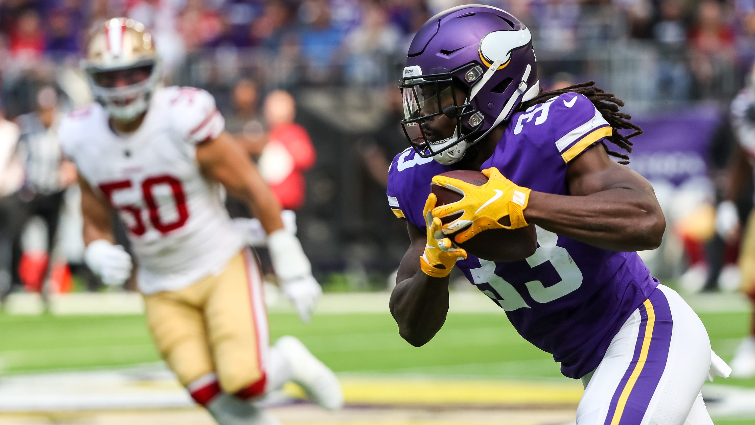 No, real Vikings never wore horns on the side of their battle helmets. The concept was made popular by a Wagner play and his character, singing fat lady Brunhilda. But, that didn't stop Minnesota from cashing in on the idea. That's fine really. Despite the fact that they the organization is prolonging a misconception, they still own some of the sweetest helmets in the league. The purple and yellow look great together too.
6. Houston Texans (pictured: Will Fuller Jr., WR)
 I think the Houston Texans team and helmet designs are both cool concepts. The dark blue and red look good together, and I think the steer on the side of the helmet, incorporating the concept of the Lone Star State, was a nice touch. The uniforms are nice with the white pants, with a full blue look. Now that DeAndre Hopkins has moved on to Arizona, Will Fuller should be the main guy for QB Deshaun Watson.
5. Cincinnati Bengals (pictured: Joe Mixon, RB)
 Speaking of great helmets, look no further than Cincy. They do, and always have, sported Bengal tiger stripes for probably the most creatively unique helmets the league has to offer. The stripes on the sides of the pant are nice too, and I like the wide orange collar on the black jersey. The Bengals are in the process of rebuilding their team this coming season, so 2020 should be interesting, running back Joe Mixon being the backbone.
4. Buffalo Bills (pictured: Josh Allen, QB)
 The Bills have never really had a bad uniform, even in the days of a darker blue uni and a red helmet. While that one was not bad at all, the newer one pictured here was broken out by the league in the early 2010s, which give the team a cleaner, slicker look altogether. I became a Bills fan when they had Stevie Johnson was running routes for them, became an even bigger fan when the team drafted CJ Spiller out of Clemson, and became an even bigger fan when the team drafted quarterback Josh Allen from my alma mater of Wyoming. Go Pokes!
3. Dallas Cowboys (pictured: Amari Cooper, WR)
/cdn.vox-cdn.com/uploads/chorus_image/image/65189252/usa_today_11840561.0.jpg) This look is and will always be one of the best. Even though the silver helmets don't quite match the pants, it still makes for a good look, and one that might be even better than if it actually did. I'm not a fan of Jerry Jones by any stretch, but I like where he's at on the team's traditional look. I don't even mind that he sports the away look pictured for nearly every single season game. It's a simple color combination, but it really works.
This look is and will always be one of the best. Even though the silver helmets don't quite match the pants, it still makes for a good look, and one that might be even better than if it actually did. I'm not a fan of Jerry Jones by any stretch, but I like where he's at on the team's traditional look. I don't even mind that he sports the away look pictured for nearly every single season game. It's a simple color combination, but it really works.2. New Orleans Saints (pictured: Alvin Kamara, RB)
 I really don't like gimmick uniform looks of the league (i.e. Color Rush). However, if the Saints ever deviated from their traditional gold and black, I'd love to see what the organization could do with the Mardi Gras colors of purple, green, and gold. I know that Mardi Gras wasn't even created in New Orleans (Mobile, AL), but they are the city most known for the celebration, so it would be kind of cool to see. Be that as it may, the Saints still have one of the better color combinations in the league, and I love the nod to the French ancestry of the city with the fleur de lis logos on the side of the helmet.
1. Tennessee Titans (pictured: Derrick Henry, RB)
 I've been a Titans fan since the days of Chris Johnson. They wore white helmets then, with usually a powder blue jersey and dark blue pants. However, the newer uniforms the team released two years ago took the cake. The dark blue helmets look great, as do the dark blue jersey and pants. But what really makes the newer uni work are the subtle accents of powder blue and red. Those color combinations are excellent, and the picture shows the team's best look. It's also shows their best player, Derrick Henry, who led my Fantasy team to its first championship.


No comments:
Post a Comment