6. Atlanta Falcons
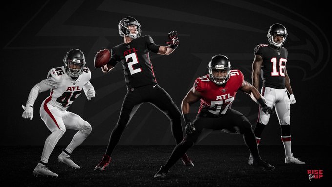 The Falcons needed their uniform update worse than any of these other teams, that's for sure. The black helmet and jersey with the white pants, their new home uni, is the best look, but I would like to see the team revert back to the glory years of their red helmets. The all white with the black helmet is decent too, but after all this time wearing the same thing, I expected something a little more creative.
5. Tampa Bay Buccaneers
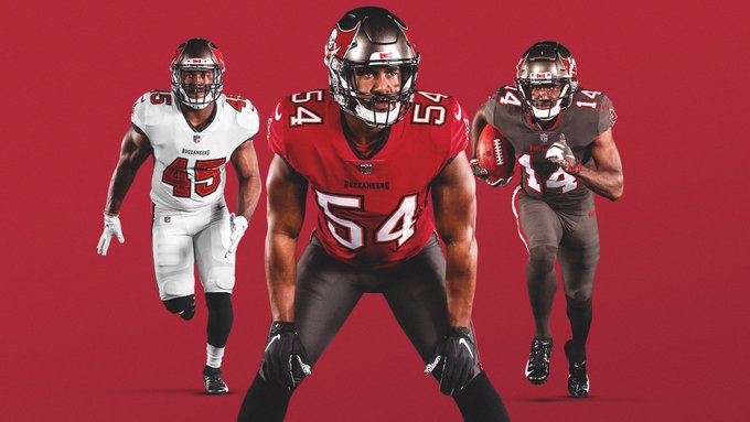 The Bucs organization got rid of the best part of their uniform. No, I don't mean the alarm clock digit numbers. I mean the sporadic slivers of orange, the only snippets resembling their old school orange and white look - a look the team never should have reverted from. The home outfit is the best here, whereas the other two are just kind of meh. The loss of the alarm clock digits is a good change though.
4. New England Patriots
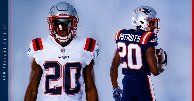 The Pats used something similar to the new home look every once and awhile last season. It looked so good, the organization decided to go with it for good it seems. The stripes on the shoulders are subtle, but I like them. This is their best look since they got rid of the old school Patriot hiking a football logo on the side of the helmet. Sans Brady, the Pats needed a new design to define a new era, and this seems to be it.
3. Los Angeles Chargers
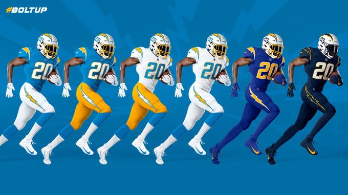 There are a lot of variations in this uni, which is a good thing, and bad thing. I like the look of the second from the left. The white helmet, powder blue jersey, and yellow pants look really good, reminding me a lot of the Wyoming home uni (sans brown jersey). The one next to it should be the away, and I think that's it. The other ones are too much like older kits and don't have very much flash. The numbers on the sides of the helmet are a nice new touch too.
2. Cleveland Browns
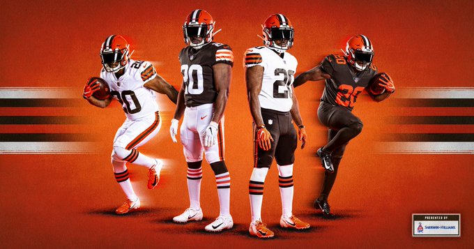 The Browns are basically reverting to the days of Peyton Hillis here. They've experimented a little too much in recent years, coming to the conclusion that they had it right the first time. There was a nice look in there with an orange helmet, brown jersey, and orange pants, but the originals are better. The orange helmet with the all white is simple, but it's a good look. Less is more, Browns, less is more.
1. Los Angeles Rams
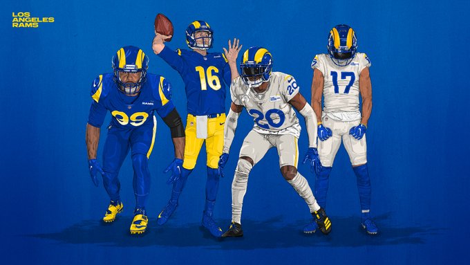 The new Rams uni looks like old school Wolverine had a baby with the Swedish flag - a look I really like, actually. Like the Browns, the Rams have experimented a little too much in recent years, in flux between the past and the present. Here's to a bright, new future with these eye-popping duds. The all blue and the all white are good looks, as is the blue jersey with yellow pants. Of the six new uniforms on display, I do think the Rams got it the most right.

No comments:
Post a Comment